The current GUI

#1
A suggestion for an improvement on the current GUIs... to start with, most of them just don't look very good =/ They simply appear to be what they are - 2D images stuck on the screen. So firstly, I think that hand-held items would be much better looking with a 3D model, probably just a better quality version of what they look like when dropped. These are items such as the radio and the S-Nav. The next part of my suggestion is for things like SCP-294 and the keypads. Again, the problem here is that simply look like low-res images, so instead, it would be much nicer if the player 'camera' actually zoomed onto their models (which would of course have to be edited a lot for this to work, so it wouldn't be easy). The rest of the game could be paused at the same time. I'm probably not explaining this well, but hopefully you will be able to see what I mean.
Image

Re: The current GUI

#2
I don't see what the point would be of creating higher poly models for something that's only seen from one static position. The sprites for the navigator and radio could be improved a bit though, I agree in that they do look exceptionally 2-dimensional.
It slep time bunner.

Re: The current GUI

#3
Maybe the radio, S-Nav and keycards could work the same way as the handheld map from Minecraft. The item could be held by the player in the lower portion of the screen as a 3D model. You would only need to look down a bit to see the item you're carrying, as opposed to having it taking up some of your screen. As for the medpack, it might be possible to have a short animation, like in DayZ, of the player placing the medpack on the floor and using whatever's inside along with a sound of equipment being rustled with.

Furthermore, I would like to see a short animation for when the gasmask and hazmat suit is put on, perhaps similarly to Cry of Fear, where the gasmask appears to be placed on the character's face instead of spontaneously appearing there. For the hazmat suit, the character should take a small amount of time and effort putting it on, a short scuffling sound should play when the character is putting on the suit accompained by a zipping noise, and the screen overlay should come in from the top of the sceen after a few seconds.
ey b0ss, can I habe de pussi plz?

Re: The current GUI

#4
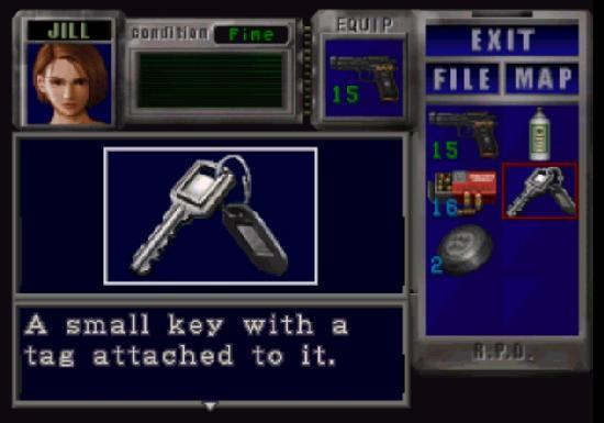
I always particularly liked Resident Evil 3's Inventory Display.
Spoiler
Image
It might work? But it would pretty much block off most of the screen. It could add special menus like estimated player health when items are found.

Heres a 10 second mockup
Spoiler
Image
SCP:CB Administrator. 99% of my statements are my own and do not represent the official developers viewpoint.

Re: The current GUI

#6
Cridone wrote: I think the current inventory is fine.
Cridone wrote: think the current inventory is fine.
Cridone wrote: current inventory is fine.
Cridone wrote: fine.
FINE? THE CURRENT INVENTORY IS UGLY IT'S JUST 10 BLOCKS AND THATS ALL!
This profile's been around for nearly eight years

RIP

(last edited 10/09/2020)

Re: The current GUI

#8
Like Taco said. The current GUI is fine, but it can use some changes. I don't see why it's ugly just because it's simple.

Code: Select all

Omniary: fuck you anglerfish can't smell
Dr. Trialtrex21: how you know bitch
Omniary: it probably could smell you though
could probably smell your fucking dank ass nasty powersuit structure gel trog ass enslaved protein bullshit sloshing in your suit from a mile away

Re: The current GUI

#9
Image
Here's a small mockup i did to give an idea of a possible GUI design.

This takes away the whole transparent-10-blocks-gui and makes it a whole new screen instead. This screen lets you see basic information about what has happened to you (nothing more than the average person could know), and implements a humanoid figure that represents 9341.

Different parts of 9341 will highlight in different colours depending on what has happened to him, for example, if he was shot in the leg, his leg will turn red, with a bullet decal being placed in the leg area. At first it will be a pale red and it will worsen as time passes/more hits are received.

Things like memetic effects can be represented too, by using a pale dark purple colour on the head, boosts in green, and diseases in yellow.

This GUI design also incorporates representing status effects, for example our Class D was shot a few minutes ago and had to go through a lockroom without a gas mask to escape the MTF, small squares will appear saying exactly what's wrong right now, bleeding (due to being shot), crippled (limping from the shot), coughing and low stamina (from staying too long in the gas), and quick blinking (due to staying in the gas.)

Also things like being able to read documents on the spot and equipping items is represented, equipping the radio on the left hand and keycard on the right would let you listen to whats going on while still being able to open keycard doors, or doing something like equipping a SCP-500 pill on the left hand would make 9341 be able to take the pill just by clicking the right click.

Healing must be done by dragging the first aid kid to an affected body part, after the process is done the red colour will slowly fade from the limb. (Depending if healing is succesful or not)

I can make a few more of these representing various situations like being hit by 106, being affected by a memetic effect, or having drunk a cup of life.
sup

roger copy bravo tango mango